Blog

The Meaning of the FreeLogoDesign Logo
On our blog, we like to write articles on various topics. This can be about the best colours to use, design mistakes to avoid, and the history of the logos of big companies like Nike, Starbucks and Ford. Recently, we realized that we had never taken the time to talk about our own logo! In this article, we'll explain how the FreeLogoDesign logos came to be, their meanings, and how you can learn from them.
A few words about FreeLogoDesign
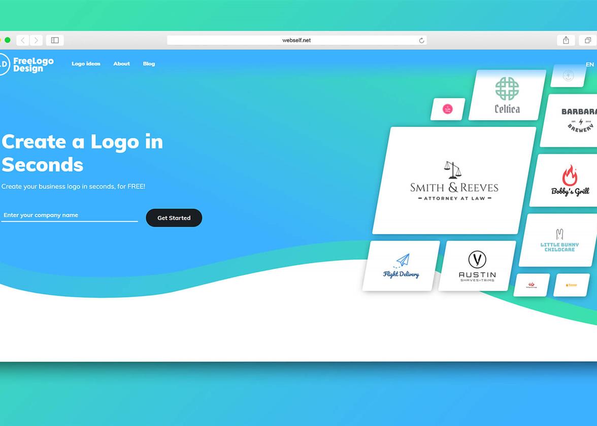
First, let's take a second to introduce ourselves properly. FreeLogoDesign is a publisher that makes it easy to create your own logo online. Since our launch in 2016, more than two million logos have been created with our platform. Our customers are entrepreneurs, craftsmen and individuals who want to save time and money by using our product.
How we explain our success. First, we offer different options for those creating logos. Getting a free logo is as easy as getting a logo in several formats in high resolution. As well, our editor is very easy to use and we have several logo templates created specifically to inspire you. You can use your computer as well as your mobile phone to create a logo with FreeLogoDesign!
The First FreeLogoDesign Logo
When the publisher FreeLogoDesign was launched in 2016, the logo was also ready. And we used it on our website, social media, in print, and advertising. The important thing then was to create a strong brand image using our emblem in different places.
FreeLogoDesign's first logo was relatively simple. It was a combined logo, a logo with both a symbol and text. Combined logos have been among the most widely used types of logos for a long time. For your first logo, it is a good idea to make a logo that has your product name or company. This is because you are not well known yet when you start your company. That is why we chose to put our company's name. As well, we used a sans serif font since this type of font is better suited for the web. You will notice that several large companies like Google, Facebook or Mozilla Firefox have chosen sans serif fonts for their logos.
Then, we chose only two colours for our first logo, red and black to make it easy to reproduce. As we have written on our Meaning of Colors page, red is a warm color that attracts attention. Black, on the other hand, is a classic color that goes well with all other shades. Finally, we decided to use three stars as symbols to show the excellence of our product. Shapes have meanings, so it's important to choose the ones that will represent the values of your company or your products.
The December 2018 Redesign
In December 2018, we decided to introduce our new logo, and our new website and brand image. Two years after this launch, FreeLogoDesign was a more mature product and we wanted it to be viewed as such in its visual identity. The trends in logos were changing quickly and we wanted to try something new. We said goodbye to red and black, and hello to blue and white. We chose opposite colours for this redesign.
Our new logo is also a combined logo. This time we decided to use the circle as the shape of the symbol. We added the initials of FreeLogoDesign inside so that we could use just this part of the logo if necessary, like for the Favicon. We also kept a sans serif font for the text to give it a more accessible look. The text is black or white depending on the background. Unlike our first logo, we decided to use shading in our new logo, going from turquoise to blue. This is a trend widely used by companies on the web since the redesign of the Instagram logo in 2016.
How to Get inspiration From the FreeLogoDesign Logo
Our first tip is to create a logo that looks good. When you find a logo that represents you well, you need to display it in as many places as possible to promote your business. Therefore, you must create a logo that can be used both on your website and in print. Keep it simple and don't use too many fonts or colours, as this could affect the quality on different mediums. Then, feel free to create different versions of your logo to meet your needs.
Don't forget to choose the shapes and colours that work with your company's values. Ask yourself what you want your potential customers to feel when they see your logo for the first time? Who are you talking to? We wanted the new FreeLogoDesign logo to be accessible, trendy, and simple. Blue is the perfect colour for logos when you want to show your accessibility as it is the most popular colour in general. This colour also represents confidence. Don't be afraid to redesign your logo if you see that your logo no longer represents you or that the trends have changed.
In conclusion, which of our logos do you prefer? The first or the second one? Whichever you choose, our team works hard to provide you with a quality publisher that will help you create a beautiful logo for your business.
More tips and tricks on the blog


