Blog
How to Add Shading to a Logo
Trends can certainly inspire you when creating your logo. For example, in recent years, several large companies have simplified their logos. Another important trend in 2020 is shading. Let's take a closer look at what it is, how to successfully do it and some examples of logos with great shading.
What Exactly Is Shading?
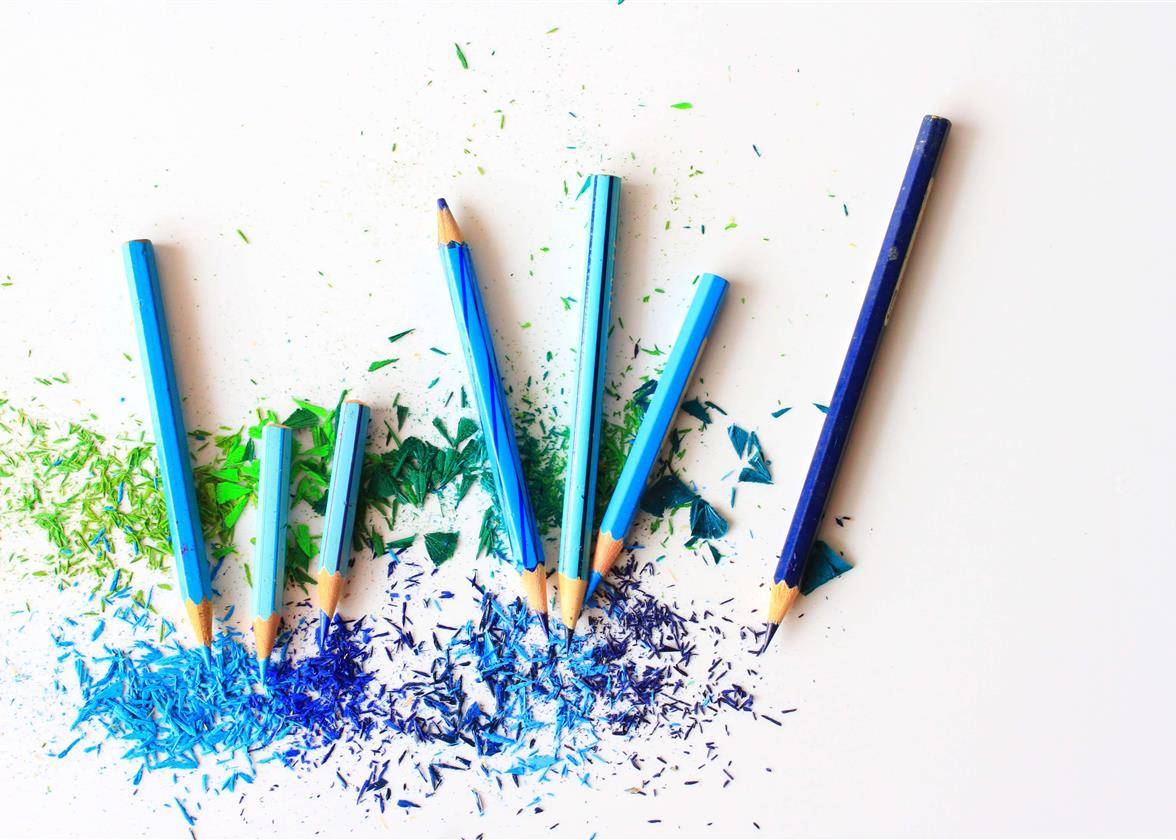
Color shading is a gradual transition from one color to another. This process has long been used in painting and for the web. Take, for example, the color red. If you add a drop of yellow, you will no longer have the same base color, but a more orange hue. If you use these two colors next to each other, you have shading for the red color. The best example of a natural color shading is simply a sunrise or sunset. The blue-sky fills with pink or orange hues with the arrival or end of the day. Color shading was very popular during the 1990s and early 2000s.
So why should you add shading to your logo? It's a multi-colour way that's very fashionable and works well on the web. This is one of the popular trends for logos in 2020. Shading can also help you convey the message you want to send to potential customers while giving a very harmonious effect. This is to be considered if you work a lot in the digital field and want to target a young clientele.
Choosing the Right Colors
What can you do to create a great looking shaded logo? One of the most important elements is the selection of colors. We know that it is important to choose the right colors for your logo as colors have meaning. For example, if you create eco-friendly products, green is a color associated with this sector, while pink is often associated with products for women. For a logo with shading, start by finding your main color. It needs to represent your business the best which includes your products and its values. Then use a color wheel to help you find the second color for the shading. If you want a harmonious result, we strongly advise you not stray too far from your main color.
Some Tips to Successfully Add Shading to Your Logo
It is easy to create a logo with shading that is not harmonious. Here are some tips to successfully create this type of logo.
1- Choose a maximum of 3 colors
The more colors you add, the more likely you are to distort the shading effect of your logo. Often, two colors are enough to create a beautiful balanced result.


2- Choose colors that work well together
Most of the time, logos with shading use similar colors on the color wheel. This gives a more understated, consistent result. For example, you could work with purple and red or green and yellow.


3- The shading must send the right message
What does your company represent? What are its values and target audience? It's important to keep this in mind when designing your logo with shading. If you want to inspire a feeling of zen, it is possible that the combination of purple with blue gives a better result than red with orange.


4- Try various combinations
You may have to try different colours before you find the ones that will create the perfect shading for your logo. It's also important that your shading looks good on different mediums. So, make sure the white or black version comes out well.
Create Shading in FreeLogoDesign
It's very easy to create shading on the FreeLogoDesign logo editor. Start by choosing a color from the selection of colours on the right. Then click on the small + located next to the box with the colour chosen in the dashboard. You can then add a second color to create the shading. You can try different shades and play with transparency for optimal results. It is possible to add as many colors as you like, but as mentioned above, we recommend a maximum of three colors to keep the effect that is very fashionable at the moment. Two colors are often enough to create well-balanced shading.

3 Examples of Logos with Shading
Many companies use logos with shading. Here are three examples that will inspire you.
Mozilla Firefox
Mozilla Firefox used shading for its first logo. Over time, the shading of the Mozilla Firefox logo has modernized to the version we know today. Whether it's with the different shades of blue for the globe or the red and yellow coat of the red panda, this is a great example to follow if you want to create a logo with shading. There are shading options for warm colors and shading for cool colours to maintain harmony.

When Instagram decided to introduce its new logo in 2016, it certainly helped launch the trend of a logo with shading. Simple, minimalist, playful, and modern are adjectives that represent this logo. Unlike others, the Instagram team decided to use shading for the background, which is also an option when creating your own logo. Additionally, we believe that this redesign is one of the most successful..

FreeLogoDesign
In 2019, we redesigned our logo to modernize it. We created different versions of our logo, including one with turquoise and blue shading for the icon. It is also this version that is used for our favicon as the logos with this shading look good on the web. We also created two different versions of the shading, one of warm colors and the other of cool colors. We have these two versions so that we can present different content and support the arrival of our new younger and current brand image.

In conclusion, dare to try adding shading to your logo. You might be surprised by the result. Just keep in mind that you should choose colors that will give a nice effect and that will represent your business well. Happy creating!
More tips and tricks on the blog