Blog
Creating a Logo: Why You Should Use Colors that Contrast
You probably already know that colors are one of the most important elements of a logo, but also of a company's branding. It is therefore essential to choose a shade that represents your values and products well. When deciding to use more than one color, what should you think about to have the successful logo? Let us explain why you should use colors that contrast when creating your logo.
What is color contrast?
Before we get started on the importance of using enough contrast when creating your logo, let's take a moment to define what it is. If you're not a graphic designer, you may not be familiar with the term.
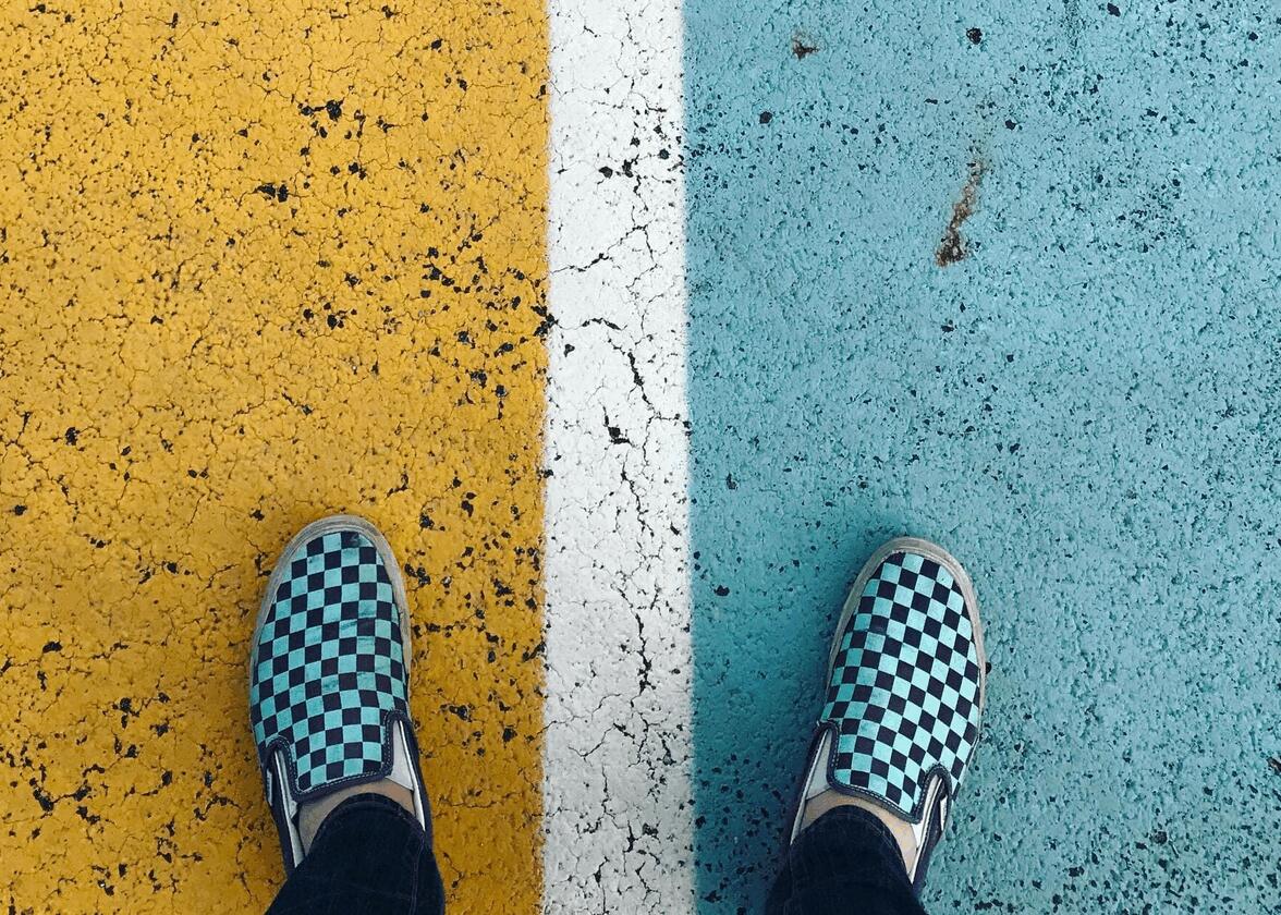
To sum it up, color contrast is the difference between two colors that are both adjacent and overlapping. The more different the colors, the higher the contrast and the easier it is to see all the details. On the contrary, if two colors look the same, there is a low contrast.
Why should you have contrast in your logo?
Now, why should you create sufficient color contrast when creating your logo? We've found three important reasons for you to consider.
To improve the readability of the text
First, sufficient contrast helps improve readability. This is essential in the world of design. In fact, if you have decided to create a signature or combination logo, your emblem will include your company name. So, you need to make sure that people can easily read the whole thing.
In addition to choosing the ideal font, adequate contrast between colors of text and the background will help readability. It is for this reason that black and white are used for texts of the books. It doesn't get any better than that.
To attract attention
Secondly, color contrasts can be a way to attract attention, which can be a plus if it's a new business logo. As is the case with warm colors, a logo that has layered colors that are very different has the advantage of standing out. A good example of this is the McDonald's logo. Chances are, you'll be able to spot their emblem from afar when you're on the road.
Colors can most certainly send different messages. For example, in the wild, brightly hued animals can be particularly dangerous. Several types of poison frogs are very colorful.
To have an accessible logo
Finally, there is the issue of accessibility. Did you know that many thousands of people have vision problems such as color blindness? For example, some people may have difficulty differentiating between green and blue and blue and purple. One solution to this problem could be to use hues that together have enough contrast, especially if the components of your logo are determined by colors and not lines.
If you want to create an accessible logo for everyone, we also recommend you focus on sufficient contrast between the text and the background, as well as choose a font that is easy to read. Also, consider using a size larger than 14 pixels for text.
Different types of contrasts
Now you know the benefits of using color contrasts when creating your logo. However, how can you ensure that the use of shades is optimal? Let us introduce you to different types of contrast that can be used during the creative process.
On the other hand, if you don't know if your contrast is sufficient, it's always possible to use verification tools. There are several of them on the web. All you have to do is enter the color codes and the system will give a score. Generally, it is advisable to have a ratio higher than 4.5.
Black and white
The contrast par excellence is black and white. There is no better contrast than the combination of these two colors. Whether you decide to use a white background with black text or a black background with white text, the whole thing is easy to read and notice. Also, black and white often have the advantage of being flexible, i.e. easy to use, regardless of the medium.
Examples of logos using black and white: Cartoon Networks, Adidas, Chanel, Uber
Complementary Colors
Then, among the popular types of color contrasts, there are the complementary colors. Complementary colors are opposite colors on the color wheel and are basically very different. Red and green, orange and blue, and yellow and purple are therefore color combinations to explore if you're looking for an interesting contrast.
Examples of logos using complementary colors: Lacoste, Heineken, Fanta, Los Angeles Lakers
Two shades of the same color
If you don't want to use black and white or complementary colors, because you want something a little lower contrast, it is always possible to choose two shades of the same color. However, you need to make sure that the color contrast is sufficient to get the benefits. For example, you could opt for a light blue and a dark blue.
Examples of logos using low contrast colors: Hawaiian Airlines, PayPal, Green Giant
In conclusion, color contrasts are definitely worth considering if you're looking for a new logo. In addition to having the advantage of attracting attention more easily, it increases accessibility. And since there are several ways to do this, there's no need to opt for a black and white logo.
Have you found the perfect shade to represent your brand? Before making your choice, we recommend that you take a look at our pages on the meaning of colors. Did you know that blue is associated with reliability, while green is the color that often represents health?
More tips and tricks on the blog