Blog

The Story behind the Subway Logo and its History
Do you know which restaurant chain has the most establishments? Despite what you may think, it's not McDonald's, Starbucks nor Burger King. It is Subway! The American company, that currently has franchises around the world, is one of the most significant players in the restaurant industry. You may be familiar with their sandwiches, but do you know the story behind the name or brand image? Let's take a closer look at the history and meaning of the Subway logo.
What Is the Story and Origin Behind Subway Restaurants?
Where does the Subway name come from, and where was it founded?
The first restaurant opened in 1965 in Connecticut, United States. Opening a restaurant started out as a plan between two friends, Fred DeLuca and Peter Buck. Rumor has it that Fred was looking for a way to finance potential medical school studies, while Peter already had a doctorate in physics. This is the reason why the company that backs Subway is called Doctor's Associates, although this company is not associated with any medical organization. Peter had noticed the craze for a new sandwich shop in their town. It is also important to mention that Fred DeLuca was only 17 years old at the time.
The original name was not Subway either, but Pete's Super Submarines. The two friends quickly opened a second restaurant, then a third. They shortened the name to Pete's Subway and then Subway in 1968. Despite all their efforts, DeLuca and Buck couldn't open as many restaurants as they wanted. So, they relied on the franchise system. In 1978, Subway reached the West Coast of the United States. In 1996, the first restaurant in England was opened. Today, there are more than 30,000 Subway restaurants around the world.
Subway's First Logo Design Meaning
What is the oldest Subway logo? What does this symbol mean?
In this article, we are going to exclude the Pete's Super Submarines original logo and focus on the Subway brand. Since the beginning, this restaurant chain’s logo has evolved over time. Subway's first logo was a signature logo–a logo made up of the company's name. Iconic arrows were added at the beginning and end of the name and have been kept in other versions. This is a nod to the entrance and exit of the restaurant, saying it's easy to come in, order and take out. It can also be associated with healthy menu items and therefore with active individuals or people who wanted to pay attention to their diet and ''Eat Fresh''. The letters were mustard yellow in colour and in a sans-serif typeface. The company had this logo for only the first 3 years of business.
Source: Logodesignlove
Subway's Different Logos and Brand Evolution
How many times has Subway changed its logo?
In 1968, a new Subway logo appeared. They have always used a signature logo relying on the company name to create a strong brand image; however, this time they added other colors and a shape resembling the famous sandwiches. The colours of the name changed to white and yellow with a green or black background depending on the version. This logo is the most recognizable in the United States.
In 1982, after 14 years, Subway decided to redesign its logo to a more modern version. The submarine-shaped background disappeared, and the letters were italicized to accentuate the effect of movement. The green background for the outline of the letters and the arrows were kept. Then, in 2015, Subway began using a variation of its logo in green. This was very short-lived as the company chose to do a redesign in 2016.
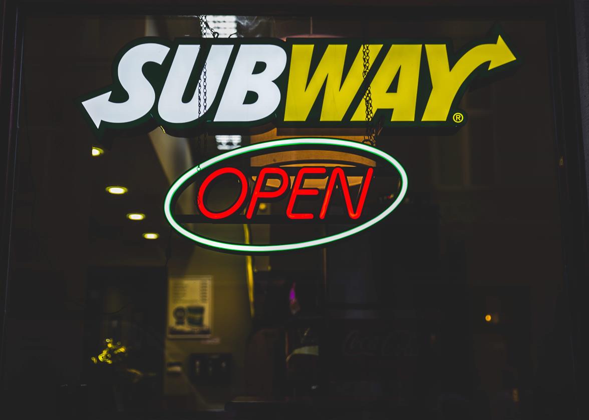
This time, no outline, no background. Subway's logo was simplified along with many others in the restaurant industry, including the Starbucks logo. The first three letters of the name were put in yellow while the last three in green. The current logo bears an uncanny resemblance to the one from 1968. The company may have wanted to go back to basics after a few scandals, including one related to one of their spokespeople. However, it is important to mention that the new Subway logo is more adaptable to the web. Their monogram version consists of two curved arrows, one green and one yellow, with white space in the middle, which forms an S. This version is easier to use on their website, for their favicon, and sometimes on commercials and marketing materials.
Source: pnclogos
The Choice of Colors for Subway's Old and New Logos
Color choices have meaning for company logos and Subway is no exception, at least for the logo since 1968. As it is a restaurant chain, they have to stand out because there is a lot of competition. Subway's values are the right diet, freshness, and speed of service. Yellow and green are good colors to illustrate movement and healthy eating. Yellow symbolizes joy and the sun, while green is the color associated with nature and health. These two colors also look good together.
Why is the Subway logo effective?
Why is the Subway logo so effective, and how can you be inspired by it when creating yours? First, we need to mention that this food chain brand remained more and more simple over time, while always using the same color palette. Its palette is also different from other restaurant brands, which helps to stand out and be recognized more easily.
Many versions of the Subway logo were wordmark logos, a type of logo only made up of the brand name, If you choose to create a similar logo, we suggest you find the perfect font to represent your message. In Subway's case, they opted for a sans-serif typeface instead of a handwritten font. It is easy to read and can give a modern touch.
In conclusion, you can most certainly draw inspiration from the Subway logo when creating your own logo. Keep in mind your values and what you offer, no need to thing big or out of the box. Then choose the right colors for your brand. Colors have meaning and can help you create a strong brand image. Then, don't forget to create a logo that can look perfectly on a napkin as well as on your website. Happy creating!
More tips and tricks on the blog


