Blog
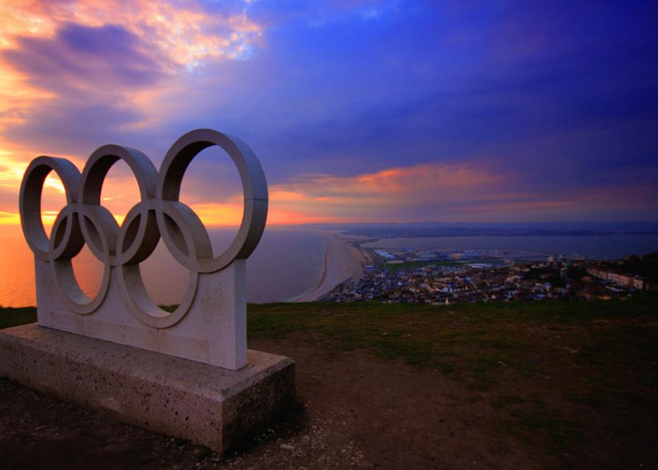
The Olympics Logo Story
Ladies and gentlemen, the Olympics have started.
Millions will be watching as athletes fight for their country, so it only fits that we talk about the Olympics logo history. What is its meaning? When was this symbol created? Let’s take a look at the story and meaning of the Olympic logo.
Who created the Olympic logo?
The Olympic logo, known worldwide, was created by the founder of the modern Olympics himself, Pierre de Coubertin. He wanted a symbol that would represent the continents in addition to the spirit of the games. The Olympic logo was created in 1913, but used for the first time during the Anvers Olympic games in 1920 since the 1916 games had to be canceled due to the First World War.
Definition
According to the Olympics website, “The Olympic symbol consists of five interlaced rings of equal dimensions, used alone, in one or in five different colours, which are, from left to right, blue, yellow, black, green and red. The Olympic symbol (the Olympic rings) expresses the activity of the Olympic Movement and represents the union of the five continents and the meeting of athletes from throughout the world at the Olympic Games” (“What is the Meaning of the Olympic Rings?” International Olympic Committee, 2021, https://olympics.com/ioc/faq/olympic-symbol-and-identity/what-is-the-meaning-of-the-olympic-rings).
But what is the exact meaning of the colors of the Olympic rings? At first, it was believed that Europe was represented by blue, Africa by black, America by red, Asia by yellow, and Oceania by green, but the Official Olympic Committee explained that it was related to colors of flags found in each continent. Also, white is used as the background color to represent peace, neutrality, and the Olympic spirit. We believe that there is a reason why circles were chosen to represent the continents on the Olympic logo. Indeed, according to our meaning of shapes blog article, circles are associated with eternity, completeness, and movement. They are also considered more friendly than squares or triangles.
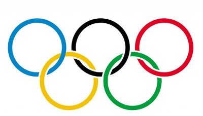
The Olympic logo
Back in 1913, when the Olympic rings were introduced, they were all interlaced: blue, yellow, black, green and red. There weren’t any significant changes made through the years, mostly rearrangement of the rings, different ways of interlacing the rings, etc. In 2010, the official version of the logo went back to its original form. It is likely one of the main reasons why this logo is so well-known; it has a strong brand image. When creating a logo, you must make sure that it is unique and representative. This is exactly what Pierre de Coubertin did when making and presenting the Olympic logo.
As is the case with the Olympic torch, there are a few rules to respect regarding the utilization of the Olympic logo. For example, during the opening ceremony, the Olympic flag is brought to the games by athletes. Then, it is hoisted into the air during all the Olympics Games. After the event, the official flag is given to the city where the next games will take place.
The Paralympic logo
Let’s take a moment to talk about the Paralympic logo since it is closely related to the Olympic Games. As you may already know, when a city hosts the Olympic games, they also host the Paralympic games. They need to create a logo for both the Olympic and Paralympic games. Often, the Paralympic games logo is derived from the Olympic games logo.
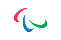
Unlike the Olympic logo, the current Paralympic logo is more recent. Indeed, there were different versions in the past but the one used today was created in 2003 by a German agency. The Paralympic logo is made up of three crescent-like lines, one red, one blue, and one green. They represent movement. A white background is once again used to represent the spirit of the games.
PyeongChang 2018
The official Olympics logo for each specific host city changes every 2 years. Every Olympics has a different one, although most of them represent fairly the same thing: ‘’coming together to celebrate sports.’’ Once again, there are various rules to follow when a hosting city creates a logo for its games.
For example, it needs to be relevant to sports and the Olympic spirit. The name of the hosting city and year must also be included in the logo. Finally, the Olympic symbol must be included at the bottom of the Olympic games logo. The creators often benefit from the opportunity to include elements related to the city, culture or country as well.
Let’s see the Olympic logo for the PyeongChang Olympic games of 2018.
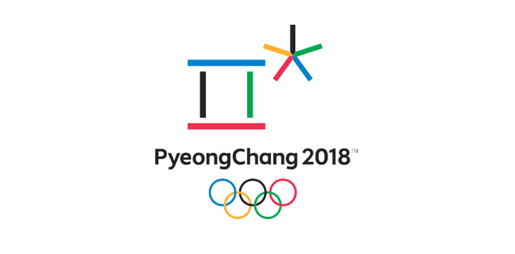
The logo for the 2018 Olympics was introduced in 2013 and created by Korean designer Ha Jong-joo. The pillar- and star-shaped emblems that make up the logo represent different characters – or letters – used in the Korean alphabet, Hangul. The pillar-shaped symbol represents “harmony” between “heaven, earth, and man,” say the Olympic organizers, while the star-shaped symbol aims to represent athletes, ice, and snow.
The Paralympic Games logo doesn’t use the pillar symbol, but instead features two star-shaped emblems holding hands, which represents unity among the athletes.
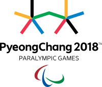
What do you think about the 2018 Olympic logo? What Olympic logo do you like the most?
More tips and tricks on the blog


