Blog

The Meaning of the Volvo Logo
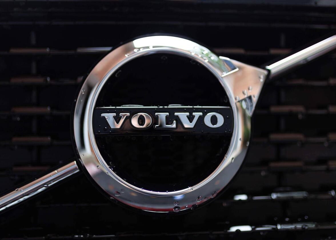
We love writing about the logos of automotive companies because they have both a strong brand and an interesting story. Some car brands have had several logos during their existence, while others have been able to keep their emblem for several decades. Today we are studying the famous Volvo logo. But what is the meaning of the symbol?
A few words about Volvo origins
Who currently owns volvo? Is Volvo Swedish?
Before we begin, let's talk about Volvo. Volvo is a Swedish automobile manufacturer founded in 1927 by Assar Gabrielsson and Gustaf Larson. Their goal was to create cars on Swedish soil that would meet the needs of the locals. Sweden is also known for its quality iron, something that would be essential for the company. The quality and robustness of the vehicles are also known qualities of Volvo. We also owe them the credit of the modern seat belt. After being purchased by Ford in 1999, the Volvo group is now owned by the Chinese Geely company.
Volvo's first logo and brand
What is the meaning of the Volvo emblem?
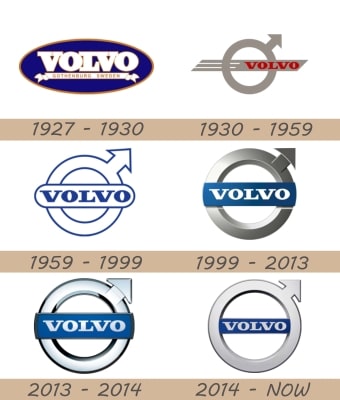
What did Volvo's first logo look like? Strangely, it looked more like Ford's current logo than the one we know today. It was an oval-shaped badge-type logo. The name of the company was included with the words Gothenburg, Sweden below to show where Volvo cars were made. The colors were also white, blue and gold, colors associated with the Swedish flag. You have to believe that IKEA is not the only one who knew how to use the Swedish national colors for their logo. This logo was only used for a few years.
Also, Volvo is a term derived from the Latin term Volvere which means to ride.
Volvo's symbol and subsequent logos
What is the history of the iron mark on Volvo cars?
As early as 1930, a new logo was created. This logo has the symbol that we associate with the company: a circle with an arrow that comes out of it. This emblem is also used today to represent the male gender. Is that the message Volvo wanted? That their vehicles were only for men? No, you have to do some research on the origin of this symbol to understand the company's choice. The symbol of the circle with the arrow without a doubt represents masculinity nowadays; however, it originally was an emblem associated with the Roman god of war, Mars. Over time, this emblem has also been associated with iron. As we mentioned above, The Swedes are very proud of producing a high-quality iron. The symbol used for the Volvo emblem is simply a reference to the iron symbol.

Source: Car-brand-names
The 1930 logo consisted of the mentioned symbol in grey. The name of the company in red also crossed through it. This logo was used until 1959 when the main logo of Volvo's was created. The red and gray disappeared, and the blue and white came back. The symbol is in the background and the company name is located in the middle. The blue was used for the letters, but also as an outline of the elements of the logo.
In 1970, the Volvo brand underwent a major overhaul. The symbol was erased to leave only the name of the company in serif font. It was a wordmark logo this time. Only the blue would be kept for this version. This redesign would be used by Volvo until 2006, when the symbol made its return. Gray was used for the emblem in the background, while blue and white were used for the company name. It should be noted that gray was a color associated with modernity. Like many other car manufacturer logos of that time, a small 3D effect was also added to this Volvo logo.
Finally, in 2014, this version would be slightly simplified. The 3D effects were reduced, and the white would disappear to leave the letters in blue. However, it is important to mention that since the 1930s, the company has always chosen the same font for their logos. This allowed continuity in the brand, regardless of the redesign.
How to get inspired by Volvo when creating your logo
Volvo's brand history and cars can certainly inspire you to create your logo. First, let's start with the origin of the brand. Volvo's first logo was inspired by the trends of the moment and the national colors of their country. These are things to keep in mind when creating your logo. Then, according to the redesigns, the same elements were reused: the symbol, the color and the font. This created a strong brand image. Moreover, the Volvo name fits perfectly when we know its meaning in latin.
Volvo has also stood out by using a symbol that had great significance for the company. Feel free to find inspiration for your logo in legends or elements related to mythology from places around the world. For example, did you know that the Nike logo is inspired by the wings of the Greek goddess of victory? These historical elements can help you stand out. Also, don't forget to keep it simple and avoid unnecessary details so that your logo can be easily reproduced.
In conclusion, before reading this article, did you know what the true meaning of the Volvo logo symbol was? Or did you know what the origin of the name of this Swedish automaker was? If you are interested in the topic of vehicle brands, we invite you to take a look at our article on the meaning of the Audi logo. Enjoy!
More tips and tricks on the blog


