Blog

The History of the IKEA Logo
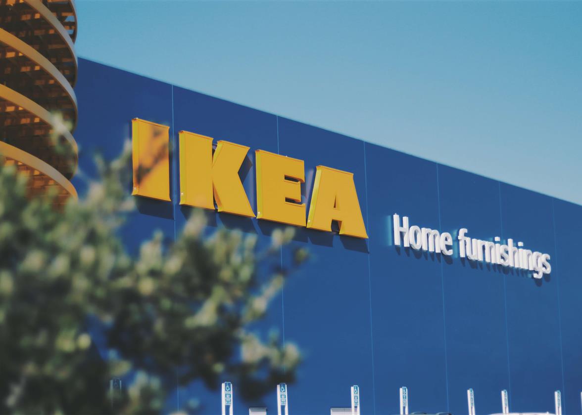
What do the cities of Dresden, Montreal, Gwangmyeong and Seattle have in common? In addition to being important cities in their respective countries, they are four cities that have IKEA stores! It seems that no matter where you go in the world, this Swedish company is not far away. Have you ever wondered about the meaning of the four letters in the name or where the IKEA logo came from? Let's take a closer look today!
A Few Words About IKEA
What is the story behind IKEA? What do the letters stand for?
Founded by Ingvar Kamprad in 1943, IKEA is a Swedish company. IKEA is also an acronym of the founder’s first and last name, the name of his parents’ farm, Elmtaryd, and his hometown, Agunnary. Ingvar had an entrepreneurial spirit at a very young age; at 7 years old, he sold matches, delivering them by bicycle. Over the years, he began selling stationery, fish, frames, and, finally, furniture. In 1945, he launched his first catalogue to meet the growing demand of his customers. In 1953, he converted a workshop into his first showroom. His main inspiration for his furniture was the FFF motto, functionality, form and ease.
In 2019, there were 433 stores across the globe Although most of the products are not made in Sweden, they have a Scandinavian touch that has made the company, its products, and affordable prices famous. It has become a shopping destination for millions of people wanting better everyday life furniture and decor.
IKEA's First Logo and Branding
What is the meaning behind the IKEA logos?
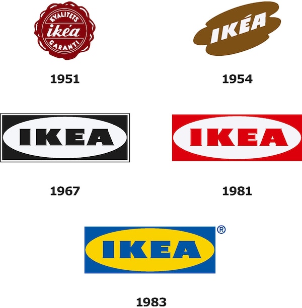
Despite what you might think, the IKEA logo has not always been blue and yellow. The first version was much different from the current one. Created in 1951, the original IKEA logo was round in shape and dark red. The letters were italics and small, and the inscription KVALITETS GARANTI (guaranteed quality) was added on the outer edges. Unfortunately (or fortunately in our case), this emblem was only used for one year.
Source: firstversions
The Ikea Symbol and Brand Identity Over the Years
Why does IKEA use yellow and blue?
By 1952, IKEA had a new logo. It looked a little more like the one we know today. This time, the name of the Swedish company was written in square capital letters. The major difference with the current logo was that everything was tilted. Other than that, the red coloring turned to brown. One wonders why IKEA decided to use brown for its logo as it is not a color widely used for branding. It is important to mention that most of the company's furniture at that time was made of wood. According to our page on the meanings of colors, brown is often associated with solidity and stability, in addition to being a very present color in nature.
In 1967, after different versions and variations, we finally got the logo that would serve as the foundation for IKEA's upcoming logos. The circle of the original logo was transformed to become an oval. The whole thing was put in a frame creating the shape that we know well. This logo was initially in black and white, but in 1981 it became red and white for a year. Then, in 1982, the company opted for blue and yellow for its logo which are the colors still used today.

Source: IKEA.com
But why did IKEA choose yellow and blue for its visual identity? The reason is quite simple: it is an homage to the Swedish flag. As we mentioned, it makes sense because IKEA is a Swedish company.
What font does IKEA use?
If you are a designer, you might ask yourself what font is used for the IKEA logo. At first, it is a bold typography using very light serifs and upper case lettering. IKEA asked Robin Nicholas to create a custom font for them, and this is how IKEA Sans was designed.
A new logo design for IKEA in 2019
Did you know that the IKEA logo was changed in 2019? This is actually one of the redesigns of the last year. However, it was only a small change and not a new logo made from scratch. The colors were kept, and the dimensions, spacing, and serifs were changed. First, the letters were brought together slightly. Then the inner oval shape was reworked to be a little rounder. This created a look that the outer shape of the logo was a little squarer and not as long. Finally, the serifs at the end of the letters were softened. This is proof that you don't need to change everything when redesigning your logo. Simplicity is often best.
How IKEA can inspire you when creating your logo in 2023?
The first inspiring element of the IKEA logo is most certainly the choice of colors. Although they tried different color combinations over time, it was really the use of blue and yellow that helped them create a strong and recognizable brand image around the world. The choice of these colors is not insignificant, these are the colors of the flag of Sweden. This company is proud of its origins and is the best-known Swedish company. It is also important to mention that blue is a color that inspires confidence and calm, with yellow representing optimism and abundance. These are definitely colors to consider when creating your new logo.
Second, the company has always been able to use its name as the main element of its logo, like French luxury brands do. Don't be afraid to use your company name or an acronym for your logo. The important thing is to choose the perfect font that will represent your products and your values. In the case of IKEA, they probably wanted to show the solidity of their furniture by using thick and imposing characters. Finally, your country or region can certainly be one of the sources of inspiration for your logo. For example, for its logo, the car manufacturer BMW was inspired by the coat of arms of Bavaria, the region where the company was founded.
Finally, the IKEA logo and brand are quite simple. You do not need to create a complicated emblem. In this case, the founder used a monogram type of logo to promote its name. The brand's name became the symbol itself with the use of colors. The only thing designers needed here was a blue rectangle and a yellow circle with the letters.
In conclusion, you now know that the IKEA logo has not always been blue and yellow. You never know how a company will evolve over time and it is important that your emblem evolve accordingly. It can even become one of the most-known logos in the world. Take inspiration from your values, but also from your origin when creating a logo that will be the basis of your brand image. Happy creating!
More tips and tricks on the blog


