Blog

The Best Logos of 70s Music Groups
What are your fondest memories of the music of the 70s? Is it the arrival of several big rock bands or the fever of disco? Whatever your preference, the 1970s were rich in good music. As part of our series of articles on the best music band logos, it's time to analyze a new era. Here is our selection of the best logos of the music groups of the 1970s and their history.
Led Zeppelin
As we saw previously in an article on the logos of 1960s bands, the British often find themselves among the most popular artists. Founded in the late 60s, Led Zeppelin is one of the bands that made the biggest impact in the 1970s. Today, we will focus on their main logo, but also on the version found on album IV.
The basic logo of Led Zeppelin was a signature logo where the letters were capitalized in a font with slight serifs. Some letters were smaller than others so that they stayed close and balanced. Then, at the time of the release of album IV, the logo used was a combined logo. The name remained the same, but they added four symbols, one per member of the group to the logo. Robert Plant chose the pen of Ma'at, an Egyptian goddess; Jimmy Page created his own symbol; John Paul Jones opted for three ovals surrounded by a circle; and John Bonham got three intertwined circles. The presence of these four symbols together would be associated with the group afterwards.
Queen
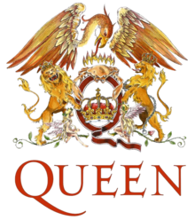
We can't talk about the 1970s without mentioning Queen! This British band remains to this day one of the most important influences of modern music. Have you ever wondered what the Queen logo meant or who drew it? To begin with, know that it was Freddy Mercury, the singer of the band who created this logo.

But what exactly does it represent? Unlike many logos of music groups, this was a badge logo or coat of arms. Mercury was strongly inspired by the English royal coat of arms for his logo. Additionally, as was the case with the Led Zeppelin logo, each of the members of the group is represented on the logo, using their astrological sign. This is why we wee two lions, a crab (cancer) and fairies (virgin) on the Queen logo, surrounding the letter Q and a crown. Finally, a phoenix completes everything at the top of the logo. It is one of the most complex, but symbolic logos of music.
Aerosmith
Most of the time, when a band chooses a logo, they keep it throughout their career. This is not exactly the case with Aerosmith which has had a few different logos over the years. Aerosmith is an American band that was founded in the 70s in Boston.

Their first logo was a kind of combined logo. Each letter of the band's name was displayed in a wing, a symbol that would be associated with Aerosmith for subsequent redesigns. In 1974, the band decided to have a new logo that looked strangely like the one we know today; an A surrounded by two wings with the group's name at the bottom. However, this version was short-lived. Then, in 1975, the band changed its logo again. This time we had the name of the group in an aesthetic and emblematic font of the 70s where several of the letters intertwined. This font is still used today. In 1979, the band opted for a signature logo, the name of Aerosmith without a symbol. Finally in 1982, we got the logo that corresponded to their needs: an A surrounded by a circle and wings with the name of the group at the bottom. There were no changes since then.
Bee Gees
While some listened to rock, others experienced Saturday night fever on the dance tracks. We couldn't talk about the 1970s without mentioning disco! And who were the kings of disco at that time? The Bee Gees! Let's take a closer look at the logo of this band whose name simply means Brothers Gibb: the band was formed by brothers Barry, Robin and Maurice Gibb.
The Bee Gees logo is a signature logo, a type of logo that includes only the name of the band. The letters B, G, and S are capitalized and somewhat larger than the other letters. The peculiarity of the logo is the font chosen. It is a decorative font reminiscent of fonts of Old English. Many lines were added to the letters, including below them.
KISS
Another very popular American band in the 1970s was KISS. The band quickly stood out thanks to its extravagant make-up, costumes, and special effects. Each member of the group was recognizable thanks to a specific make-up: the demon, the child of the stars, the cat and the man of space. For a long time, rumors circulated that KISS was an acronym for Knights in Satan's Service, but they were all denied by the band members. If this were the case, the KISS logo would have been a monogram logo.

Ace Frehley, the band's guitarist, created the KISS logo. Back then, it was a signature logo where the letters were put in front with a dark outline and shading in some versions. Speaking of different versions, KISS had to use a variation of its logo at shows in some countries (Germany, Austria, Israel) because the two S of the original logo looked a little too much like the symbol of the SS, a squadron of Nazi Germany, according to some. This was not the intention of the creator, saying that it was rather two lighting bolts.
In conclusion, do you agree with our choices? It's amazing to know that it was often a member of the band who created the logo. What do you think was the best band of the 1970s? Discover our choices of the best logos in our next article on the 80s!
More tips and tricks on the blog


