Blog

The Best Logos of 60s Music Groups
To stand out, music groups must have a strong brand image that can be used everywhere – records, posters, promotional items, etc. Whether you are a musician or an admirer of rock music, we decided to create a series of articles on the best logos of music groups. Today, we start with a look at the logos of 5 important bands from the 1960s.
The Beatles
Let's start with the mythical band of the 1960s – The Beatles. Founded in England, it didn't take much time for the formation of Lennon, McCartney, Harrison, and Starr to gain worldwide popularity. According to Fast Company, it was when buying a new drum for Ringo Starr that their manager decided that the band's logo should be displayed on the front. The logo that we know so well today was then quickly drawn. It is composed of a B that extends above and a T that extends below the other letters.
The Beatles logo is a relatively simple signature logo and easily modified. The ends of the letters have slight serifs that give a certain style. The fact that it was displayed directly on the drums most likely helped the marketing of the group.

The Rolling Stones
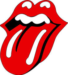
Another extremely popular English band of the 1960s was the Rolling Stones. However, it wasn't until 1971 (yes, we are cheating a little) that The Rolling Stones finally found their logo. Specifically, the band had difficulty in their early days finding a logo that resembled them. But when they needed a logo for a European tour in 1970, they found an art student named John Pasche to create one. What exactly were the inspirations? First, the tongue of the Indian goddess Kali represents the anti-authoritarian movements, Mick Jagger, and of course some sexual connotations at the request of the group.
The Rolling Stones logo is simple, unique, representative, and easily reproducible. It would be used on several promotional products over time. The symbol is so well connected to the band that you don't have to add the name The Rolling Stones for it to be recognized.
The Doors
Let's now move on to the American side. In the 1960s, the Californian band The Doors was very popular. So, what about their logo? It was also a signature logo, a logo composed only of the name of the group. In its original version, The Doors logo consisted of two different fonts. A first art nouveau type font was used for THE and the DOORS part used a stencil type font. Over time, the whole thing has been harmonized with a stencil-type font and is still very recognizable today.
Most of the time, the logo was displayed in black or white. Since it was relatively simple, it was easy to use on different mediums. In addition, the logo is still associated with the band's frontman Jim Morrison, who died in 1971.
PS: You can find the Allerta Stencil font in FreeLogoDesign if you want to create a logo with a stencil effect.
The Beach Boys
Another very popular, Californian, 60s band was The Beach Boys. When the hits Wouldn't It Be Nice, Surfin' U.S.A. and Kokomo played on the radio, it brought a breath of fresh air, especially warmth. Now let's take a closer look at their logo. Like most of the other logos mentioned in this article, this is a signature logo. The well-done, representative, italic font shows the young image of the group. The letters are attached to one another, the two B letters are uppercase, while the last few letters are used to create rows under the group's name. In addition, this logo has not been redesigned during the band's career.
As it is also a relatively simple logo, it has been used in different colors to meet different needs. Black and white were frequently used as well as yellow to show us the Californian side of the group.

The Who
Now let's go back to Britain to introduce you to the Who logo. This rock band from the 60s and 70s has a logo that could be called a badge logo. The most well-known and used version is the target logo. It is the group's name displayed with a background of three circles (red, white, and blue) that look like a target. First, the name of the group is presented with a relatively simple sans-serif font along with a couple of details. The two Hs are connected, and an arrow (or the male symbol) was added to the letter O.
Second, what is the link between the BMW logo and that of The Who? Both use an element associated with their region of origin on their logo. For The Who, the colors of red, white, and blue on the background are a nod to the flag of Britain.
And you, what 60s music band logo is your favorite? What logos should we have added to our list? In the coming weeks, we will publish our next article on the subject: the best logos of the music groups of the 70s! Will you be able to guess which ones are our favorites?
More tips and tricks on the blog