Blog
Logos with Hidden Meanings and Secrets
A company's logo is more than just a mere symbol. It visually represents the organization's identity, values, and mission. But logos can be more than just a brand representation, as many are cleverly crafted with hidden meanings that add another layer of intrigue to the design. These logos often incorporate secret symbols, messages, or imagery that hold special significance, telling a story about the brand or company.
The hidden details are intentionally included in the design, making the logos more than just a simple emblem. These covert details can add depth and meaning to the logo, making it a more memorable and recognizable representation of the company's brand identity. By incorporating hidden meanings into the design, logos can become a powerful tool in establishing a brand's identity and creating a solid connection with its audience.
In this article, we will delve deeper into some of the most amazing logos with hidden meanings. We will explore the reasons behind their effectiveness in leaving a lasting impact on their viewers.
Beats
The Beats by Dre logo may seem minimalistic - a lowercase "B" in a white circle. However, it's more than just a representation of the brand name. The logo resembles a person's head wearing the brand's popular headphones. The logo has a flipped ‘b’ to ‘d’ for Dre to represent ownership. This design choice gives the logo a more human look and feels, adding to its overall aesthetic appeal.

Baskin Robbins
Baskin Robbins, a well-known ice cream company, has a youthful and fun logo with a hidden meaning. The pink segments of the letters "BR" form the number "31", representing the number of ice cream flavors the company initially offered. The circle stands for the wholesomeness of the flavor. Carol Austin, VP of marketing for Baskin-Robbins, explains, “The logo is meant to convey the fun and energy of the Baskin-Robbins brand. The 31 stands for our belief that our guests should have the opportunity to explore a fun, new ice cream flavor every day of the month”. The logo was introduced in 2005 as part of an entire brand refresh.

Amazon
Amazon's logo is undoubtedly one of the most famous logos with hidden meanings. The e-commerce giant has embedded a couple of clever messages in its design. The arrow starting from "A" and ending at "Z" is shaped like a smile, complete with a slight dimple that resembles happiness. Additionally, the "A" to "Z" connection in the logo symbolizes the vast range of products available on the platform, indicating that Amazon has everything from A to Z.

NBC
The NBC logo has a couple of hidden meanings woven into it. The white figure in the center of the vibrant teardrop forms is intended to resemble a peacock. The corporation selected this style to pay homage to the fact that it debuted when color television was first introduced. Additionally, the six colors in the peacock's tail feathers represent the six different divisions of NBC.

Sony VAIO
Sony Vaio, the "Visual Audio Intelligent Organizer" company, has gained global recognition for its technological advancements. Though its logo appears simple, it cleverly integrates the letters "V" and "A" to resemble an analog wave. At the same time, the "IO" section represents binary code by resembling a "1" and a "0" upon closer inspection.

FedEx
We are looking at logos with hidden meanings, and one of the most popular examples is the FedEx logo. The design appears in various colors and is displayed on different delivery vehicles. The strategic placement of the "E" and "X" at the end of the logo creates an arrow in the negative space, symbolizing the speed and forward-thinking of the company. This design element highlights the company's commitment to progress and continuous improvement.

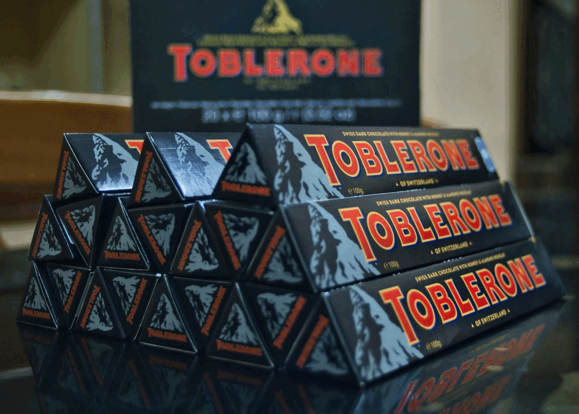
Toblerone
Mondelēz International, formerly known as Kraft Foods, owns Toblerone, a chocolate brand that originated in Bern, Switzerland, a city well-known for its association with bears. If you examine the Toblerone logo closely, you'll notice a mountain shape. Inside the mountain is a hidden bear to showcase the specialty of the region Toblerone is manufactured at. This detailing extends to the shape of the chocolate as well.

Unilever
Unilever's logo may seem like a disorienting mix of shapes and patterns. But upon closer inspection, we can spot allusions to the vast array of products the brand offers. By amalgamating diverse designs to create a large "U," Unilever's logo underscores the brand's remarkable versatility. The ‘U’ stands for their care for the customer base and building products that care for humans.

Hyundai
The Hyundai logo holds multiple meanings. Firstly, the word "hanja" in Korean represents modernity and innovation. Secondly, the logo depicts two individuals shaking hands, signifying trust between the company and its customers. Thirdly, the oval shape surrounding the H represents global expansion. Lastly, the silver color represents sophistication and modernity. In addition to these, the logo also represents acceptance, community, and teamwork. The simplicity of the logo's design is intentional and is meant to convey the brand's focus on quality and reliability. The Hyundai logo successfully conveys the brand's progressive approach and commitment to excellence.

So, why do companies invest millions of dollars in inventing logos with a hidden meanings?
Logos serve a meaningful purpose as they are an opportunity for a brand to convey important information about their company in a single, compact image. While the message hidden in a logo may not be immediately apparent, it is carefully crafted to achieve a specific goal. Every aspect of a logo, from its colors to typography and shapes, has a unique effect. Layered meanings can be created through clever designs, such as the Amazon logo, which features a smiling line that links the letters 'A' and 'Z,' showing that the company sells everything.
By incorporating hidden elements in the whitespace or positioning some aspects in a logo, an extra layer of meaning can be added to the design. This hidden message can provide insight into the company's history or the product's origins, as seen in the Toblerone bear. Ultimately, this message aims to create a deeper connection with the brand's target audience. Hidden meanings in logos can make customers feel special and engaged with a company, building a lasting relationship.
More tips and tricks on the blog