Blog
Internet Explorer and Edge: The History of Their Logos
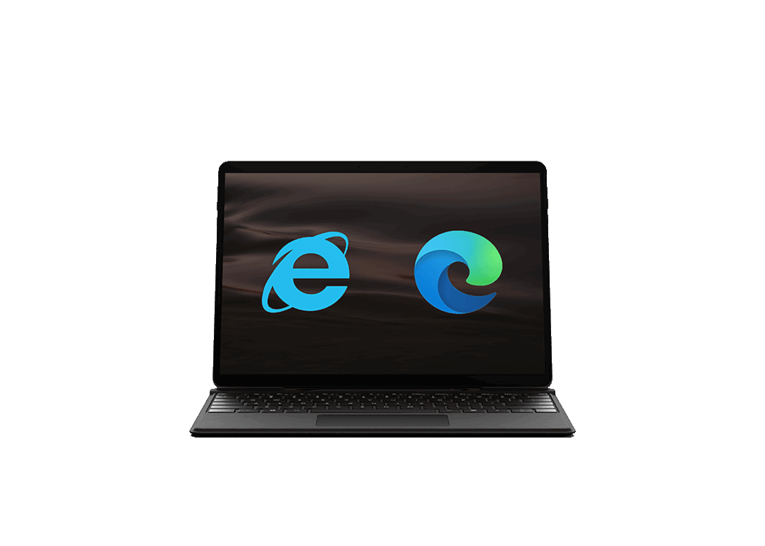
What to say about Internet Explorer? You may have used it in the early days of the Internet when it was the most popular web browser. This creation by Microsoft was one of the pioneers in its field. It was very easy to recognize the logo of the Internet Explorer with its famous blue E. With the arrival of today’s successor, Edge, we still see a hint of the digital world that has existed throughout the evolution of this logo.
A Few Words about Internet Explorer
Before we begin the analysis of the Internet Explorer logo, let's take a closer look at the story behind this browser, as loved as it is hated. In 1995, the Internet Explorer appeared as a paid option for Microsoft's Windows 95. The browser was then directly integrated into Windows 98 resulting in it being used a lot more. In the years that followed, Internet Explorer became the most important internet browser before being overtaken by Mozilla Firefox, Apple Safari and Google Chrome in 2010. In 2015, as the competition became fierce, Microsoft banked on a new app called Edge and slowly moved away from the out-of-date Internet Explorer.
The First Logos of Internet Explorer
The first logos of Internet Explorer were very much related to Microsoft. In fact, initially, it was only a product for Windows. However, over the years the web browser developed its own brand identity. From 1995 to 1997, the Microsoft Internet Explorer composition was used with three logos. These three logos were also created during a short period of time, the three being combined logos: the company name with a graphic. However, the third Internet Explorer logo, the 1996 version, saw the arrival of the E we know so well. Starting in 1997, Microsoft was removed keeping only the graphic for future versions of the logo.
The Logo Over Time
From 1997, the Internet Explorer logo remained fairly unchanged. There would be different versions, but it was always easy to recognize the web browser’s blue E accompanied by a slightly slanted circle that crossed over the E. This type of logo was a symbol logo which other large companies were using like Apple and MasterCard. Symbol logos have the distinction of being associated with strong brand images as they are recognized with no company name attached.
In 2001, the blue logo of Internet Explorer would get a slight 3D effect with the addition of shadows to give the appearance of depth. This would be accentuated in the 2006 version. The circle surrounding the E would change to yellow with this version. This would finally be simplified with the 2011 and 2012 redesigns. The yellow would also disappear to leave only the blue.
Source: Versionmuseum.com
The Arrival of Edge and The New Brand Identity
What better way to relaunch a product than to do a complete overhaul? This is exactly what Microsoft did when it launched Edge: the successor to Internet Explorer in 2015. The first Logo of the Edge browser was very similar to that of Internet Explorer. It was composed of a blue E, although it was not the same shade as previous versions. The major difference between the two versions was the ellipse that had once accompanied the letter. The Edge logo used the concept of a circle to create sharp ends. This made some sense since the word edge means contour or sharp. Of course, this is a nod to the Internet Explorer logo. One might even think that this was a new version of the original product.
In 2019, Microsoft would finally step out of the ordinary with the redesign of the Edge logo. For once, it didn't look like it's hundredth redesign of the original logo. This time, the logo was more circular in shape. You can see a wave or even the letter E, which remains the common thread between all the versions of these logos for Internet Explorer and Edge. However, it is not so much the shape that attracts attention, but the use of several different shades for the first time. We go from blue to turquoise to green. It is important to mention that shading is one of the biggest trends for logos right now, especially on the web. We only have to mention the Instagram logo as an example. However, the use of a shading for an Internet browser is reminiscent of the Mozilla Firefox logo, one of its competitors. In short, whether you like it or not, it's still a very different redesign from the last few versions.

Source: Underconsideration.com
How to Draw Inspiration from Internet Explorer or Edge for Your Redesign
There are many ways to be inspired by the branding of Internet Explorer and Edge. First, their logos have often been simple and representative which is perfect for the digital world. It is also worth noting that blue is one of the most used colors for logos. This is because blue is associated with both knowledge and trust, in addition to being one of the most beloved colors in general. As well, don't hesitate to do minor redesigns of your logo to adapt it to the times and trends. Keep important elements to create a connection between versions, as Internet Explorer has done over the years. This is in part a desire to maintain an up-to-date brand image.
In conclusion, we hope you were able to satisfy your curiosity by discovering the story behind the various logos of Internet Explorer and Edge. Regarding the new redesign, what do you think? Do you like the audacity of several different shades or on the contrary is it too showy? If you need more inspiration, at the evolution of the Amazon symbol over the years.
Sources:
https://fr.wikipedia.org/wiki/Internet_Explorer
https://www.theverge.com/2019/11/2/20944341/microsoft-edge-chromium-browser-logo-icon-wave-surf-new
Try our logo maker to design a logo you love in minutes.
More tips and tricks on the blog