Blog
Why You Need a Black and White Logo
One of the most important questions to answer when creating your logo is what color it should be. First, it is suggested that you create a color palette that represents your company’s values and products. So, why not create a black and white logo? Or, at least have a version of your logo in shades of gray. Let's take a closer look at the benefits of creating a black and white logo.
Why Choose Black and White for Your Logo
Some will say that black and white logos are dull. To this we say that it all depends on the creation and the message you want your brand image to have. Several companies have used these two colors brilliantly. This combination gives a timeless touch to your logo. This should be considered if, for example, you want to keep your logo for many years or want to focus on the name of your company. Also, black and white logos often have a strong contrast that increases legibility. There are also different shades of white and black that you can use depending on the effect you are looking for. For example, for black there is raven, wing or dorian, and for white there is ivory and off-white.
As well, black and white logos have a major advantage: they are easily adaptable. Whether for print or for the web, your logo will always look its best. For example, if you need to print a document with a header using your logo, a black and white one will look good especially if the printer cannot print in color.
The Meaning of Black and White
Before we go on, why not take a moment to think about the meaning of black and white? Although these are technically not colors per se, these are still interesting shades to use when creating your logo. Black is often associated with the night time, but also with elegance. A suit or a black dress are timeless. Can you think of any logos that mainly use the color black? We can name Chanel and Adidas as examples. They are both companies that have been around for decades and have a strong brand image.
As for white, it is the color of purity, peace, harmony and wisdom. That is why this hue can be found in the fields of technological advances or luxury products. Think of the Apple logo. Their brand image is both strong and uncluttered–even modern. It is also important to note that white cannot be used alone for a logo since it is often the color of backgrounds.
Why You Should Have a Black and White Version of Your Logo
Whether you have a color logo or not, we recommend you have a black and white version. Your logo must be at its best, regardless of the medium used. If you have to use your logo on a colorful background, the colors of your logo may not look harmonious. This is where your black and white version comes to the rescue. Have you ever noticed that there are different versions of the FreeLogoDesign logo? We have a colored icon version, a black version and white version. This allows us to use our logo effectively and anywhere!
If you don't know where to start, did you know that FreeLogoDesign offers you the opportunity to have a black and white version of your logo? When you choose our high-resolution package, it is possible to purchase the Black and White option. Our editor will automatically generate versions of your logo in shades ranging from black to white.
3 Inspiring Black and White Logos
Since it is always interesting to have examples, let's take a closer look at three logos that are black and white.
The New York Times
In the 19th century, it was not really possible to print in colour. The basic colour of print was therefore black. The logo of the American newspaper The New York Times has been in use since 1851 and has changed little since then. The name of the newspaper can be found in a stylized font with an old-fashioned effect to show its years of experience. Since the New York Times logo is mostly used on print, the contrast makes reading easier.
 Source: nytimes.com
Cartoon Network
Who said a black and white logo couldn't be fun? This is exactly what Cartoon Network, a channel specializing in cartoons, has done. Their logo has been playing with contrasts since its inception in 1992. Initially, the inspiration was a chessboard where the colors were inverted in each box. The current logo kept the C and N of the company's name in two squares, one black square with white writing and one white square with black writing.
![]()
Source: Wikipedia
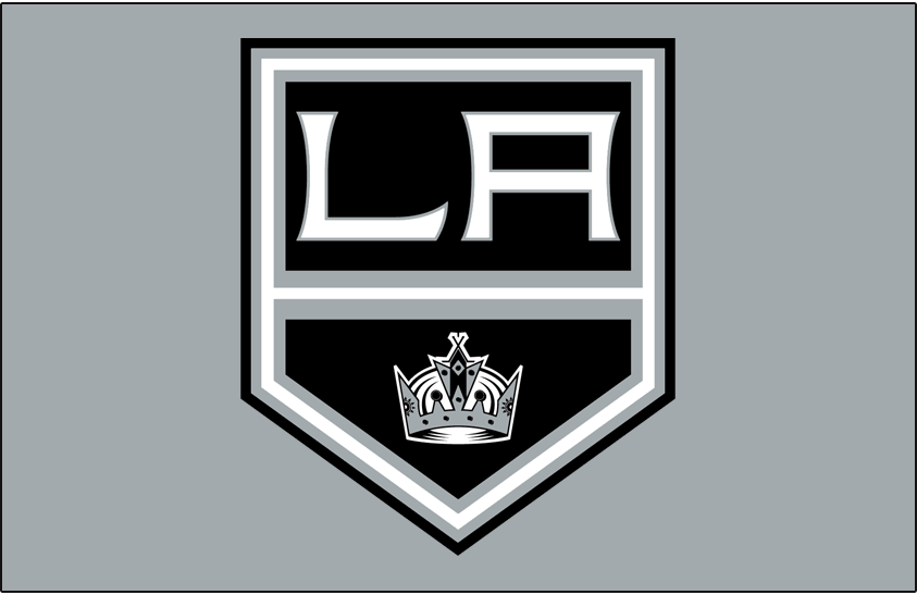
Los Angeles Kings
There are also a few sports teams that have been able to use the combination of black and white for their logo. One of these teams is the Los Angeles Kings, an American ice hockey team. Although this team opted for bright colors in the past (yellow and purple), since 2011 they have proudly used a logo using black, white and gray. This gives an effect that is both very refined and modern.
Source: sportslogo.net
In conclusion, we hope to have given you the idea that you should try black and white when creating your logo. However, if you don't opt for this color combination, don't forget to have a version of your logo that will stand out, no matter the medium. Enjoy creating!
More tips and tricks on the blog